Tampa Bay Buccaneers are a professional rugby franchise from the South Division of NFL, which was established in 1974. The team won numerous Division champi-onships and one Super Bowl in 2002. Today the franchise is owned by the Glazer family and has Bruce Arians as the head coach.
Meaning and history
![]()
The visual identity history of the Buccaneers is fully based on the team’s name and hasn’t had many redesigns throughout the years. There are actually just two main versions of the logo created, the initial ones depicting a portrait of a pirate and the flag-logo, which has been slightly modified during the years. As for the color palette, red has always been the main shade, symbolizing passion and power.
1976 – 1996
![]()
The original logo, nicknamed “Bruce the Buccaneer” was designed by Lamar Spar-tan in 1976. The famous artist was well-known for its works in the local newspaper. The logo depicted a portrait of a winking pirate executed in red and yellow. The man was holding a knife in his teeth and had a large ring in his ear. The feather of his hat and his long hair were weaving to the left, adding dynamics to the overall image. The Bruce stayed with the team for almost twenty years and even today it remains a very recognizable emblem.
1997 – 2013
![]()
The redesign of 1997 brought a new style to the Buccaneers’ visual identity. The red weaving flag with a white skull, two crossed pirate sabers, and an orange foot-ball on them — this is how the new logo looked like. The flag featured a thick black outline and was placed on a saber with a red handle.
2014 – 2019
![]()
In 2014 the flag was modernized and gained a brighter red as its main color. The saber was now all silver-gray and the skull was completely redrawn in a more con-temporary way. The whole logo began looking stronger and cleaner.
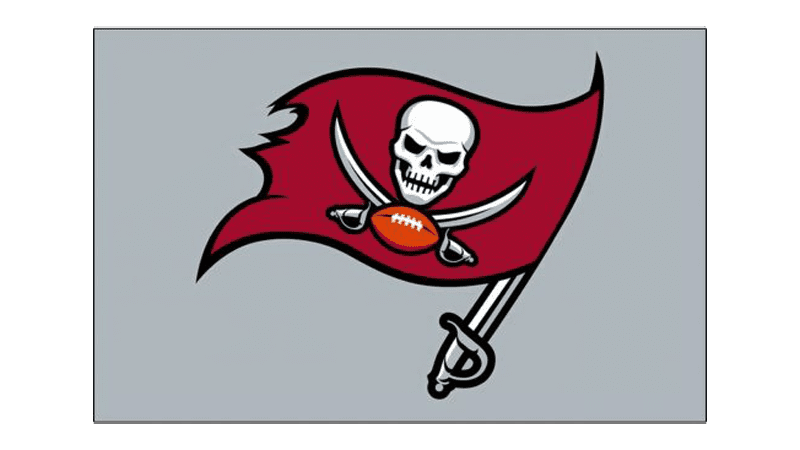
2020 – Today
![]()
The redesign of 2020 was mainly about the color palette of the flag. The team came back to a darker shade of red and the football is now also drawn in a more intense orange color.
Symbol
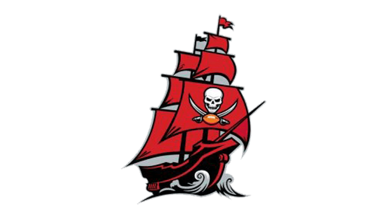
The symbol of the Tampa Bay Buccaneers is a burgundy pirate ship with numerous sails and the iconic skull with sabers and football on the biggest one. The ship looks powerful and evokes a sense of confidence and courage.
Emblem
For their emblem, the team usually places the iconic flag on a white or dark gray background, adding a custom and instantly recognizable red wordmark in a white outline with a thin black shadow. The letters of the inscription are executed in a styl-ized serif font with their tails and serifs elongated and sharpened.
Helmets
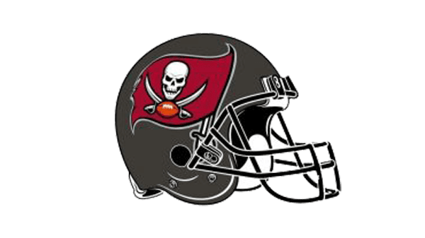
The plain dark gray helmets of the team feature the massive grill of the same color and have the enlarged red flag on the sides. It looks unique and recognizable, evoking a sense of power and determination.
Uniforms
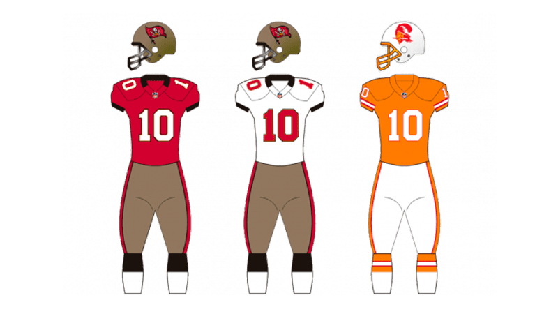
The main home uniform of The Tampa Bay Buccaneers consists of a dark red jer-sey with a white player’s number and delicate gray details, and dark gray pants with red and black side stripes.
For the road outfit, the team wears a completely white unit often with red accents, outlined in dark gray.