Phoenix Cardinals was the name of the today-famous professional rugby team from NFL, Arizona Cardinals, during the time period from 1988 — 1993, while they were playing for Phoenix.
Meaning and history
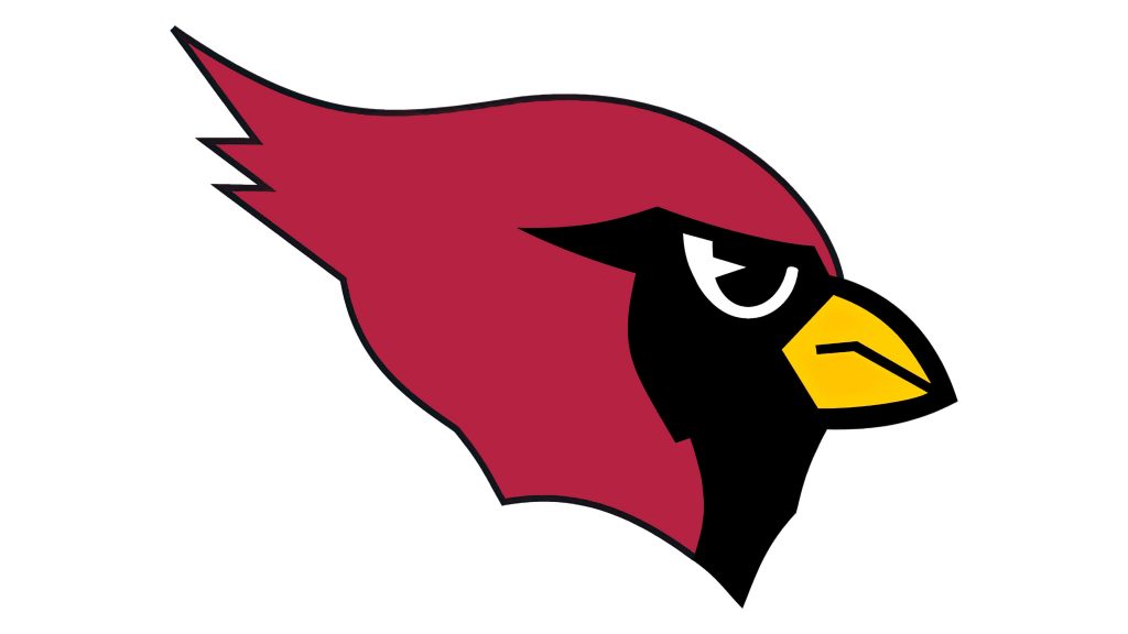
Actually, there was no special logo created for the team while they were located in Phoenix. It was the logo, taken from 1970 design of the St. Louis Cardinals’ visual identity — a burgundy-red head of the cardinal bird, drawn in profile, looking to the right.
The beak of the bird was colored yellow, adding a sense of joy, happiness, and en-ergy, while the addition of black details on the cardinal’s face reflected power and professionalism of the team.
Moreover, the same logo stayed with the team after they changed their name to Ar-izona Cardinals, o let the color palette was slightly changed — the red became lighter.
Emblem
The red bird’s profile was usually placed on a red or black background, in order to gain a powerful land passionate look and mood.
Another version was created in 1993, while the team was still called Phoenix Cardi-nals — it was a horizontally placed rectangular, with the deep blue bottom half and the cardinal-red upper part with yellow stripes, resembling the sun rays. However, this image only became official one year later, in 1994, after the team changed its name.
Helmets
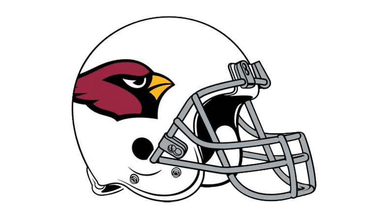
In 1988 the team started using the helmet design we all know today — the white helmet with light silver massive grill is decorated by a big and bright Cardinals’ symbolic bird on the side.
Uniforms
In 1988 the team already started wearing the same uniform style, as we all know today — the jerseys and pants in a traditional combination of red and white. For the home uniform, they chose red jerseys with white numbers and details, and white pants with thick vertical red stripes on the sides.


