Philadelphia Eagles are the name of one of the professional rugby franchises from the East Division of NFL. The team was established in 1933 and is considered to be one of the strongest and most successful franchises in American football history. Today the team is owned by Jeffrey Lurie and has Doug Pederson as the head coach.
Meaning and history
![]()
The visual identity of The Philadelphia Eagles has a pretty rich history, there were seven major redesigns, but one thing that never changed is the main hero of the logo — the eagle. It has always been there, as the symbol of the team, their courage, speed, and power.
As for the color palette, it is interesting that all the versions, except for the very first and the very last ones, featured the green and white combination, while the two others are executed in a blue color scheme. This is how the team celebrates its legacy and heritage.
1933 – 1935
![]()
The initial logo for The Eagles, created in 1933, depicted a very detailed image of a flying eagle, who was holding a football in his claws. It was a beautifully executed picture in blue and white colors, which reflected the team’s loyalty and expertise.
1936 – 1942
![]()
The color palette and the contours of the bird were modified in 1936. Now it was a green and white emblem, the eagle looked more determined and the ball was enlarged. This version stayed with the franchise for five years.
1943
![]()
1944 – 1947
![]()
In 1944 the team gets a new contemporary logo. It has fewer details and sleeker and bolder contours. The placement of the bird is now more vertical, which adds a sense of progress and growth. The green shade got a bit darker and less white accents are now on it.
1948 – 1968
![]()
The eagle spreads his wings in 1948. The color palette remains the same, while the composition of the logo is switched to a horizontal one. The bird is now flying, reflecting freedom and speed.
1969 – 1972
![]()
The redesign of 1969 brings more modernity and geometry to the iconic emblem. The wings of the bird gain straight lines and cuts, they also became slightly shorter. The contours of football became thicker, and it is now more visible. This logo only stays for three years, but is still very recognizable and is loved by the team’s fans.
1973 – 1986
![]()
The franchise’s visual identity from the 1970s featured a bright green helmet with a wide and bold gray wing on the side. The wing boasts a thick white outline, which makes it more distinct and clear. The image is perfectly balanced by a white grill of the helmet.
1987 – 1995
![]()
The ornate and detailed eagle with a football comes back in a new execution in 1987. Now the bird is looking to the left and has orange and brown colors added to the traditional team’s palette. The wings of the bird have more white accents, which make it look powerful and strong.
1996 – Today
![]()
A completely new style, concept, and color palette came to The Eagles’ logo in 1996. The composition we all know today comprises a sharp and modern image of the bird’s head in profile, looking to the left. The image is executed in white, silver, and black color palette, with a touch of light blue, resembling the initial team’s logo. The eagle looks dangerous and aggressive, representing the fighting spirit of the team and their willingness to win.
Symbol
The flying eagle has always been a symbol of Philadelphia’s famous rugby franchise. This bird is commonly known as the strong, fast, and dangerous animal, which also looks graceful and confident.
Emblem
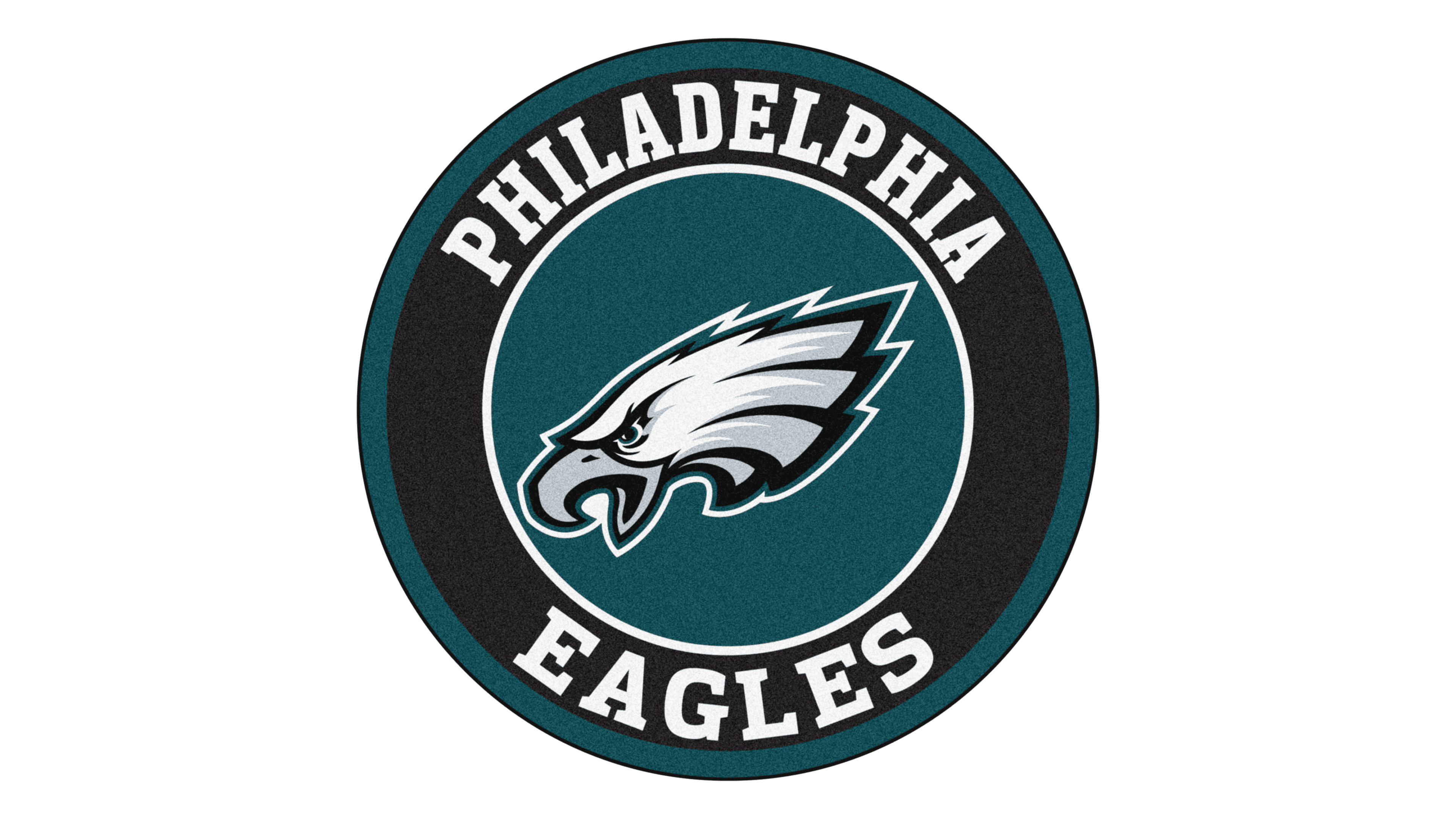
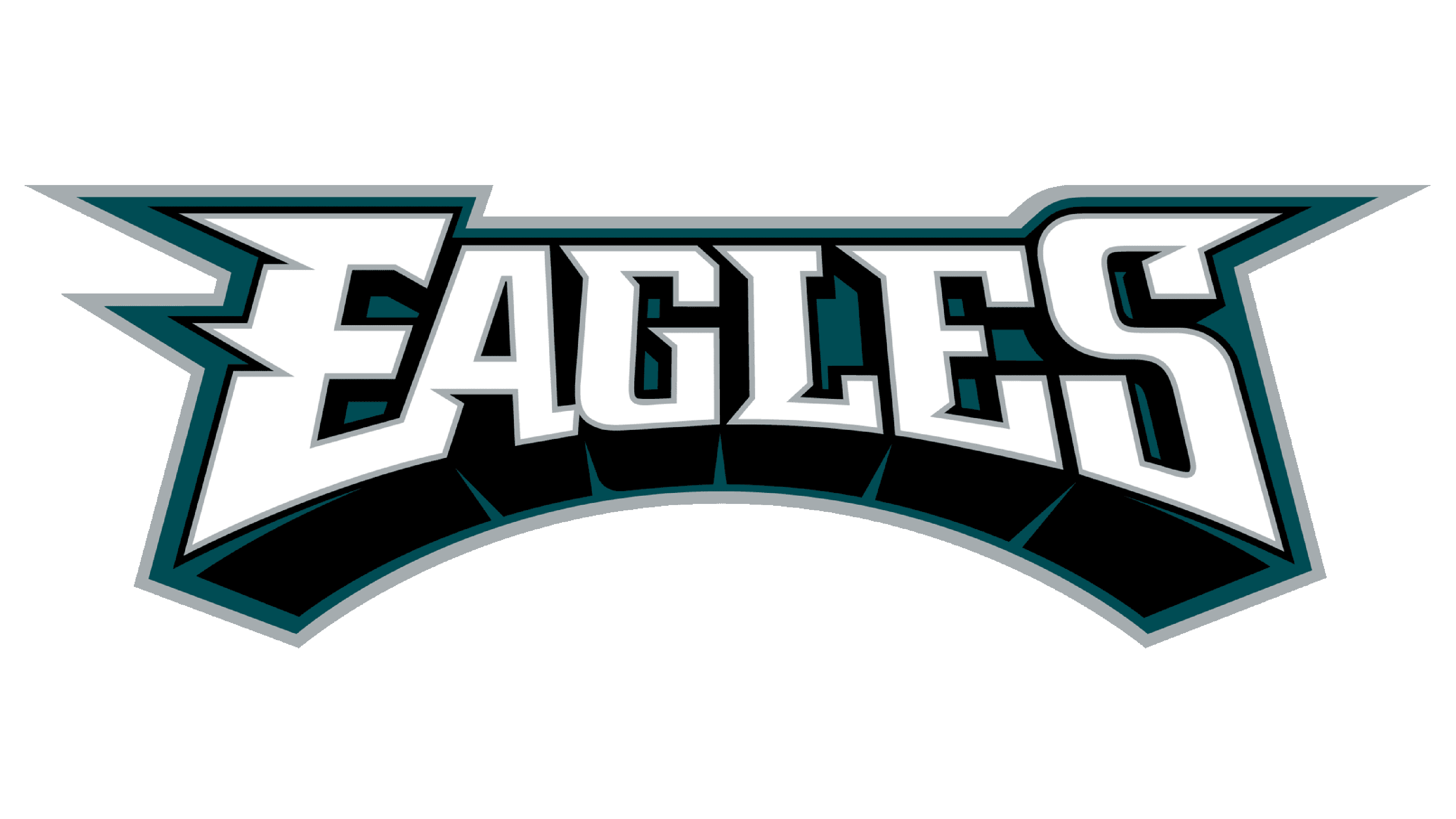
For their emblem, the team uses the eagle’s head from the official logo, placed on a dark sea-blue background. It makes the image look brighter and more distinct. Sometimes the emblem is accompanied by a wordmark, executed in a custom serif font with first and last letters’ lines elongated and sharpened.
Helmets
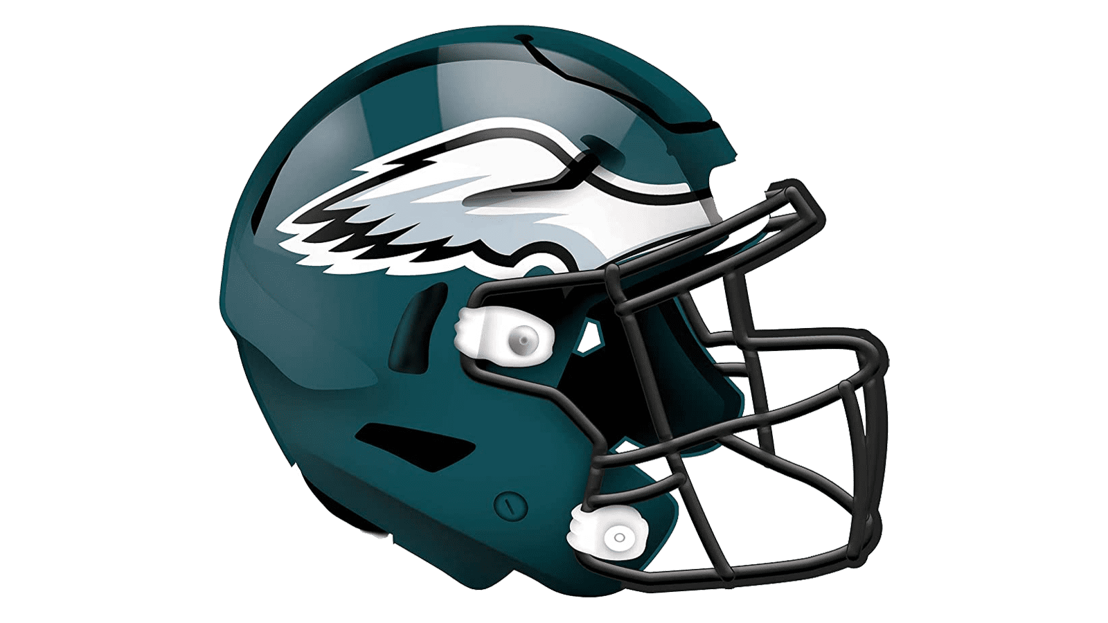
The helmets of the Eagle always featured green and white or silver color combinations, but with the logo redesign of 1996, the main color of the helmet has been changed to a sea-blue. The silver and white wing in a thick black outline are placed on the sides of the helmet and there are no more additional details. As for the grill, it is executed in black, balancing the outline of the wing.
Uniforms
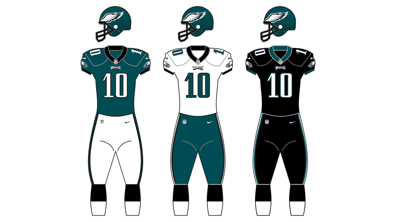
The sea-blue jersey and white pants are the main uniforms of the team. With white numbers on the tops and blue stripes on the bottoms, the uniform looks instantly recognizable.
For the road outfit, the team wears white jerseys with blue elements and numbers, and sea-blue pants with thin black and white side stripes.