Oakland Raiders was a professional rugby team from California, which based in Oakland from 1960 until 1981 and then from 1995 until their relocation to a new place — Las Vegas.
Meaning and history
![]()
The Oakland Raider’s visual identity has always been based on one mascot, whose portrait he never left the logo and no major changes were done to it. And yet relo-cating and changing the team’s name to Los Angeles Raiders and later — Las Ve-gas Raiders, the visual identity has been kept as was originally designed.
1960 – 1962
![]()
The very first logo was designed for the Oakland Raiders in 1960. The iconic pirate, or raider, in an old-style rugby helmet and a patch on one eye is still the symbol of the team, which is instantly recognizable among all the fans of American football. In the first version, the portrait of the pirate was placed on a dark yellow vertically lo-cated rugby ball, with two crossed sabers on the background. The handles of the weapon were executed in the same dark yellow shade.
1963
![]()
In 1963 the Franchise changes its logo to a more “pirate” one. Now the mascot por-trait was placed on a gray and black shield with a curved top and a pointed peak. The football was gone from the emblem and the color palette became all gray and black. The full name of the team in light gray was written on the top of the shield, right on its black part.
1964 – 1981
![]()
The colors of the logo were switched, and gray became black, while the black parts were colored gray, in 1964. Now it was a solid black shield with a gray image and a white “Raiders” wordmark above it. The lettering was executed in a simple yet clean and confident sans-serif typeface. Another change was made to the pirate’s helmet — it was now all gray with a thick black stripe in the center. The team kept this ver-sion even after their relocation to Los Angeles, in 1982.
Emblem
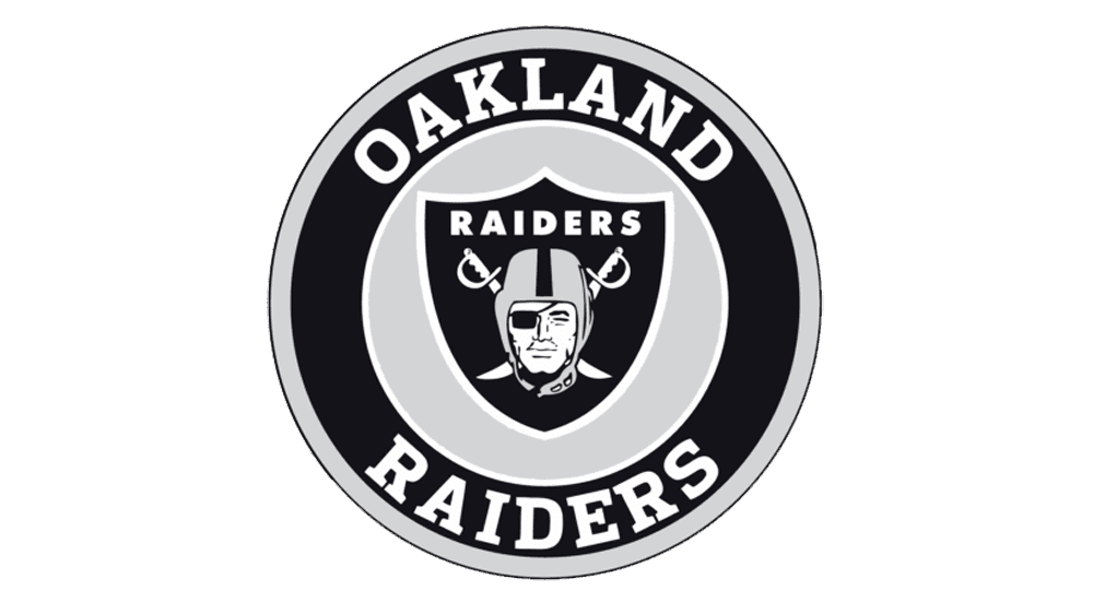
As their main emblem, the team placed its black shield in a thick white outline on a gray or black background. Sometimes the emblem was accompanied by alogotype in one of two styles — it was whether all-caps on ExtraBold sans-serif font with clean traditional lines or a stylish italicized typeface, with lots of space and air be-tween the letters.
Helmets
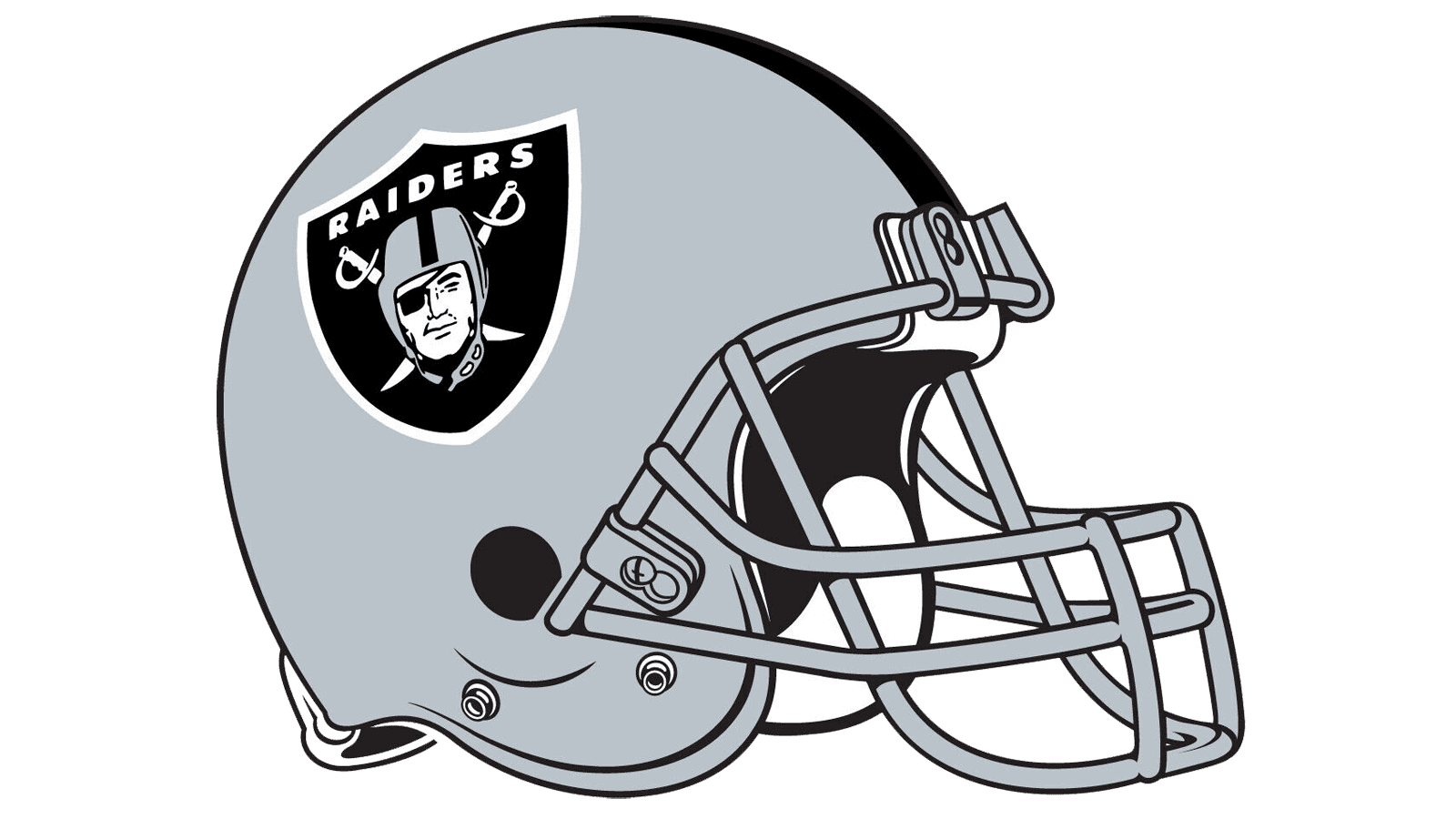
Until 1962, the helmets of the team were plain black, with no images or decorations simple black, with a silver metal grill. Then the team added a bright yellow stripe, and, finally in 1963, placed their logo on the helmet. It was a solid gray background, with a thick black line in the middle, and an outlined emblem on the side.
Uniforms
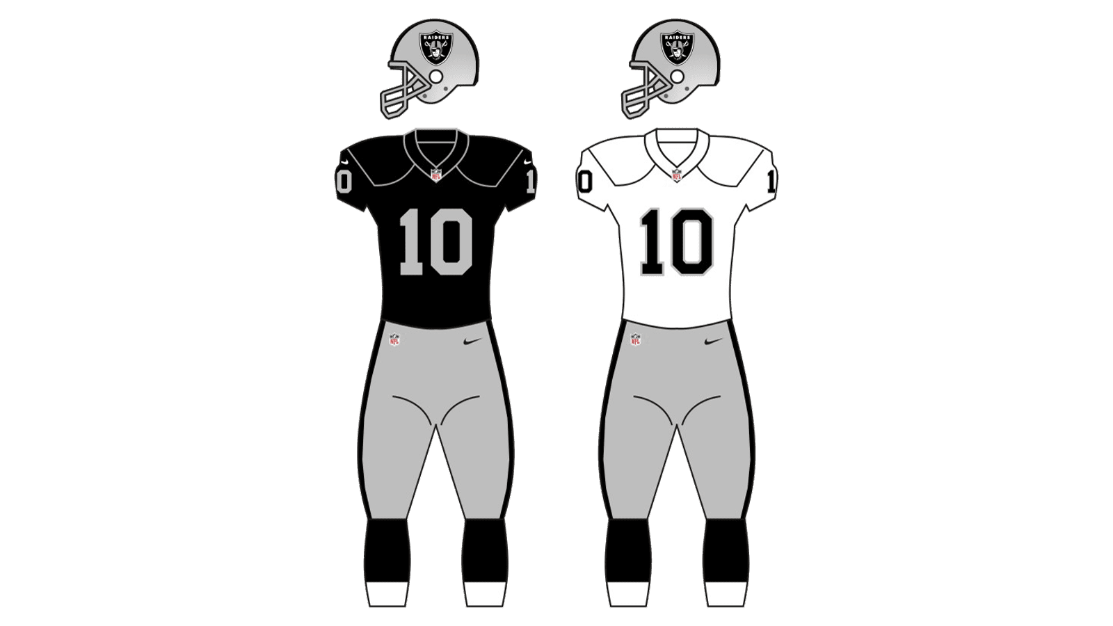
There were two versions of the uniform designed for the team — the home one, with black jerseys and gray pants and the road one — white jersey with black num-bers and shoulder accents and gray pants with black vertical side stripes.