Houston Oilers was the initial name of the Tennessee Titans, a professional rugby franchise, which was established in 1960. The team played under this name for more than 30 years, while they were based in Houston, and before their relocation to Tennessee.
Meaning and history
![]()
The team, established in Houston, relocated to Tennessee in 1997, changing their name to Tennessee Oilers, and keeping the last Houston’s logo for the first few years.
1960 – 1961
![]()
The very first logo for the franchise depicted an image of a “cozy” man wearing a gold cowboy-hat and boots. The cowboy was wearing a blue rugby uniform with the “Oilers” wordmark and had a golden football in his hand. The background featured several oil rigs, celebrating Houston, the mother city of the rugby club.
1962 – 1968
![]()
With the redesign of 1962, the cowboy’s hat was replaced by the oil helm, and the yellow color of the palette — by the light gray, close to silver. The silhouette of the man and the background remained untouched, as well as the main blue color.
1969 – 1971
![]()
The new concept was created for the team’s visual identity was created at the end of the 1960s. Now the logo was composed of a white helmet in a thick black outline with the geometric image of the black oil rig on it. The stylized abstract profile of a man can also be seen.
1972 – 1979
![]()
The bright and pleasant color palette replaced the boring monochrome, changing it to intense blue and red, where the helmet’s contour and the man’s profile were ex-ecuted in thick blue lines, and the oil rig became bright red, featuring a thin blue outline.
1980 – 1996
![]()
The rig from the previous logo now became the main hero of the new team’s visual identity. The color palette was changed to light blue and a thin red outline, the image was mainly placed on a white background, which made it look bright fresh and very modern due to the geometric silhouette and straight lines. The team took this logo with them to Tennessee.
Symbol
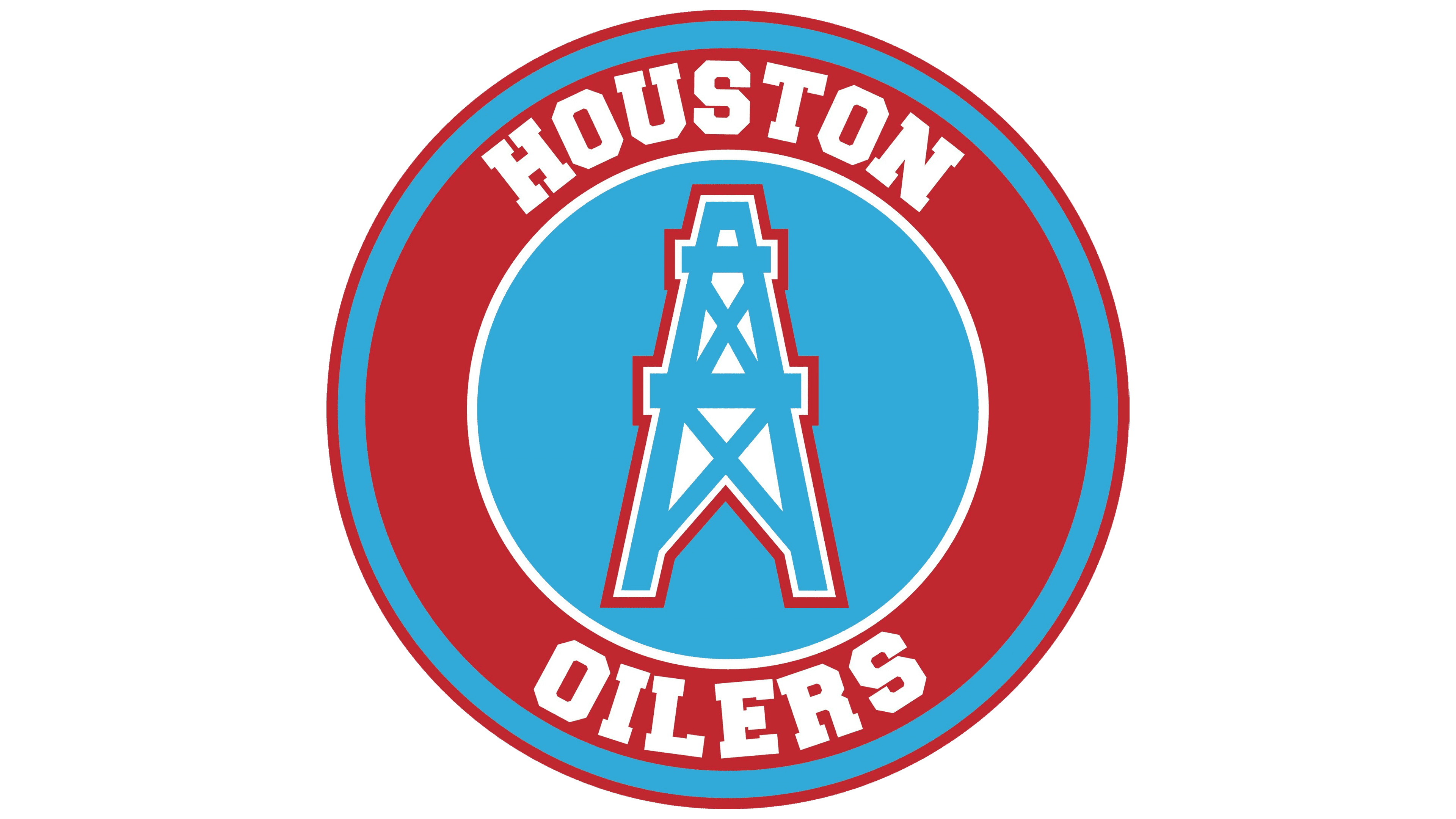
The Oil rig in the blue, white, and red color palette has been a symbol of the team for many years. A celebration of the main industry of the team’s hometown, along with the National American tricolor makes the logo truly patriotic and memorable.
Helmets
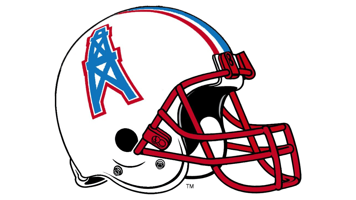
The helmets of Houston Oilers have been redesigned many times, but they all had one thing in common — the exquisite and elegant light blue and white color palette, perfectly balancing the strong and geometric rig contours. The last version of the helmet was composed of a plain white background, bright red grill and middle stripe, and a light blue rig image on the side.