Green Bay Packers are a rugby team from the North Division of NFL, which was established in 1919 in Wisconsin. One of the oldest American football teams was created by Earl Lambeau. The club has won 13 championships and is one of the most famous rugby teams across the United States.
Meaning and history
![]()
For the first 15 years after its establishment, the team was known under the name “Acme Packers”, so the initial logo was composed of the wordmark with that name. The Green Bay Packers appeared only in 1937 and had several visual identity redesigns until they finally found their style, which is instantly recognizable across the United States today.
1921 – 1936
![]()
The Acme Packers logo was a simple green and yellow wordmark, set in two levels. The lettering was executed in all capital letters of a simple sans-serif typeface, where the yellow lines were placed on a green background, repeating the inscription contour. The color palette of the original team’s logo is still in use today, celebrating the roots and heritage of Green Bay Packers.
1937 – 1955
![]()
After being renamed in 1947, the team got their logo redesigned. Now it was a strict and strong “GB” monogram in dark blue with a thin gray outline. The overlapping letters featured straight lines and sharp angles. This logo stayed with the rugby team for almost twenty years.
1951 – 1955
![]()
The additional emblem was designed in 1951 and was used along with the version from 1937. It was a colorful image with the red and yellow rugby ball and the bold green “Packers” inscription with a thin yellow outline.
1956 – 1961
![]()
A completely new style of Green Bay Packers’ visual identity was created in the 1950s. The team removed all the lettering from their logo and now it was a vertically located football with an image of the player throwing the ball. The color palette of this emblem repeated the initial one — green and yellow, trout yellow was the main shade.
1961 – 1978
![]()
The redesign of 1961 brought the logo we all know today. The minimalist letter “G” enclosed in a dark green oval is a stylish and strong emblem, which looks perfect on the team’s helmets.
1980 – Today
![]()
In 1980 the previous logo was slightly redesigned — the thin yellow outline was added to a green oval with the white bold “G”, showing the team’s value of its history and legacy. The clean lines and the oval shape of the logo reminds of the football and shows the team as a professional and strong one. Green color here symbolizes growth and progress, while the whole letter stands for loyalty and stability.
Emblem
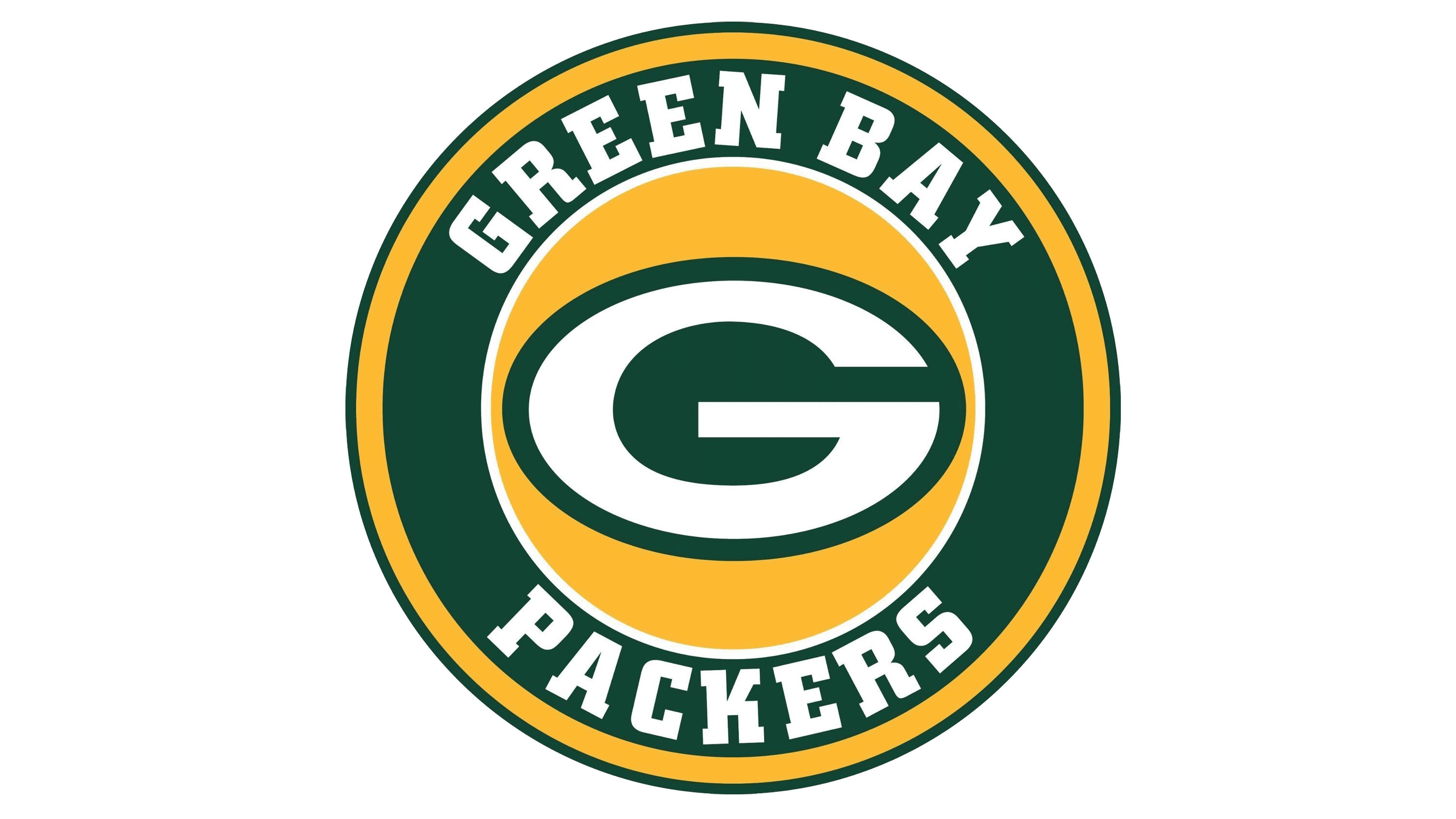
The current emblem of The Green Bay Packers rugby team is the white letter “G” in a green horizontally placed oval, located inside the yellow square. It is simple, yet bright, and very recognizable. The emblem is sometimes accompanied by a wordmark, executed in a custom sans-serif stencil typeface with thick lines and traditional letter cuts.
Helmets
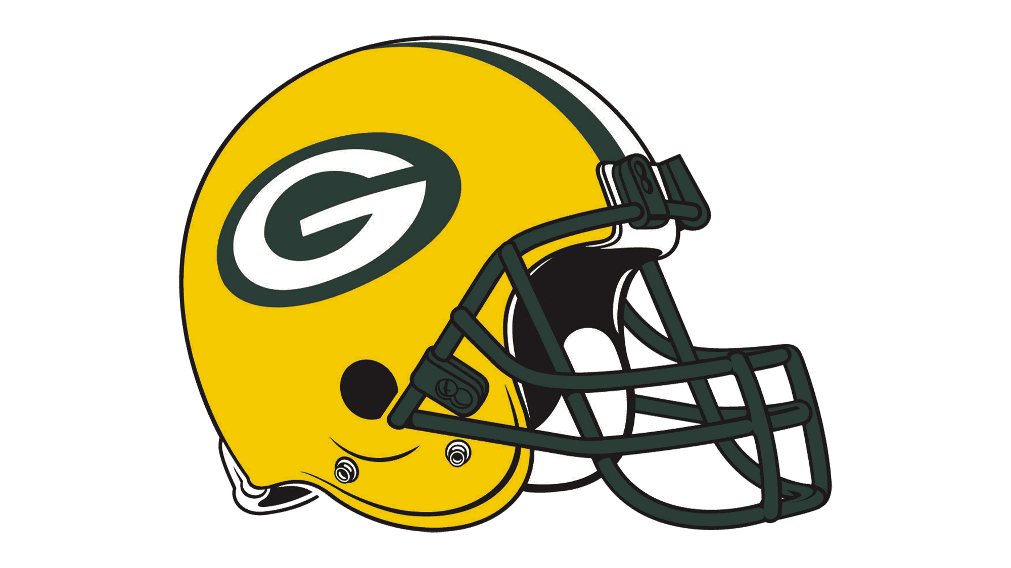
The team from Wisconsin is known for its bright yellow helmets with the green and white emblem on the side. The grill is executed in dark colors in order to balance the brightness.
Uniforms
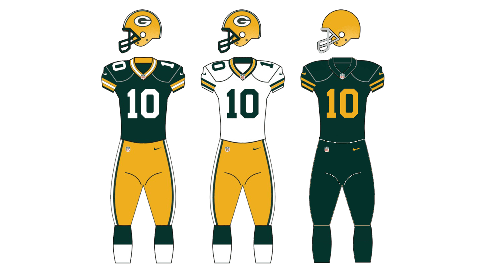
The Green Bay Packers uniform is executed in the three official colors of the team — green, yellow and white. The main set is composed of a white jersey with dark green numbers and details and yellow pants with green and white stripes on the sides. The alternative version of the uniform is the green jersey with white accents, the yellow pants are the same.