Card-Pitt was a professional rugby team from the 1940s, which was created through the merger of two teams — Chicago Cardinals and Pittsburg Steelers. The name was also derived from two — Cardinals and Pittsburgh.
Meaning and history
![]()
The team, created for just one season in 1944, had a very simple year strong and professional logo designed. It was a wordmark in all capitals, executed in a rich burgundy color, placed on a white background. The straight lines and distinct cuts of the letters reflected the strong fighting spirit and reliability of the merged team.
Color
Burgundy is one of the colors, which are timeless in their style, chic and elegance. It represents passion, along with confidence and excellence, evoking a sense of stability and power. In combination with white, it also gives a feeling of loyalty and responsibility.
Font

The modern serif typeface of the Card-Pitt logotype resembles the AZ College font, with its bold strict lines and traditional geometric cuts. It looks simple yet brutal and strong.
Emblem
The most known emblem of the Card-Pitt team is undoubtedly their logotype, but there was also a bright and ornate image, composed of both team’s visual identities — a circular burgundy-red medallion with three flying cardinal birds, having their beaks in yellow. The bright beaks were balanced by the inner round outline and the birds’ wings contouring. It was a beautiful image, resembling a traditional Chinese art and its intense yet calm colors.
Helmets
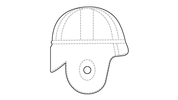
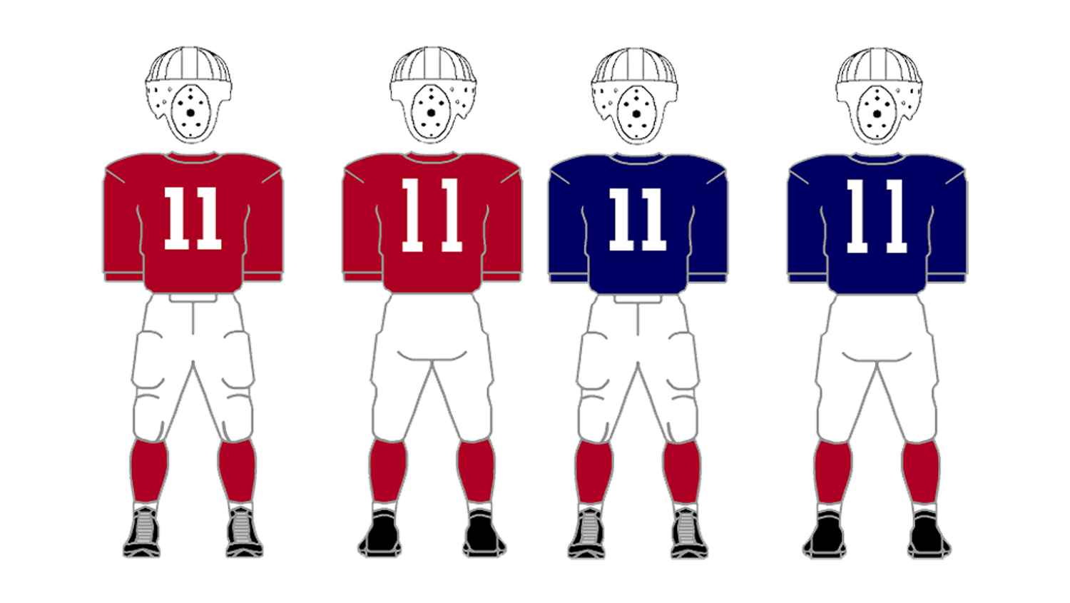
The team was established in 1944, and the first logos appeared on the rugby hel-mets only in 1948, so the Card-Pitt leather helmets featured a plain white color, without any decorative or even colorful elements.