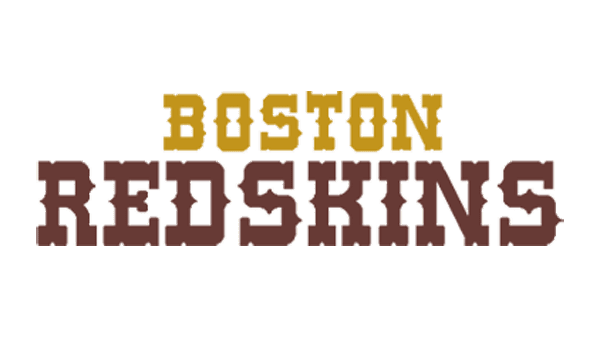
Boston Redskins was the second name of one of the most popular rugby teams in NFL, The Washington Redskins. The team played under that name from 1933 to 1936, after the first “Boston Braves” title.
Meaning and history
![]()
As the team existed under the Boston Redskins name for just three years, there is no surprise that they only had one logo in their history, and, of course, it was a pre-decessor or the famous Washington Redskins visual identity concept.
The logo of the Boston’s team from the 1930s was composed of a circular medal-lion with a profile of a Native Indian man, executed in monochrome, with two white feathers in his raven-black hair. The only colorful detail of the initial logo was the double outline of the circle — the black frame was complemented by a thick orange contour, adding a sense of passion and energy.
Symbol
Since the very beginning of the team’s history, the image of an Indian man has al-ways been the main part of their visual identity. He was always shown with huge respect, as a symbol of strength, fight, and determination. The man was facing right, so there was an impression that he was looking into tomorrow, to the future, and his concentrated brutal face evokes a sense of confidence and stability.
Color
The black, white, and orange color palette was a pretty good choice for the fran-chise’s logo, as these three colors create a perfect combination, which represents professionalism, dynamic, and loyalty — the three main qualities of the team management and its players.